Introduction
Apple’s Vision Pro has set a benchmark in design and animation effects. If you’re a developer or tech enthusiast looking to replicate that stunning animation using CSS, you’ve come to the right place! In this guide, we’ll break down the process step-by-step, complete with code examples and tips to enhance your skills.
Why CSS Animations?
CSS animations are a powerful way to enhance user experience without overwhelming your site with heavy JavaScript. They allow for smooth transitions and can give your web application a modern look. Let’s dive into recreating the Vision Pro animation!
Understanding the Animation
Before we begin coding, it’s essential to understand what makes the Vision Pro animation unique. The animation is characterized by:
- Smooth transitions
- Layered elements
- Subtle scaling effects
Step-by-Step Guide to Recreate the Animation
Step 1: Setting Up Your Environment
To get started, create a simple HTML file and link to your CSS stylesheet. Here’s a basic setup:
<!DOCTYPE html>
<html lang="en">
<head>
    <meta charset="UTF-8">
    <meta name="viewport" content="width=device-width, initial-scale=1.0">
    <link rel="stylesheet" href="styles.css">
    <title>Vision Pro Animation</title>
</head>
<body>
    <div class="container">
        <div class="vision-effect"></div>
    </div>
</body>
</html>
Step 2: Creating the CSS Styles
Now, let’s add some CSS to style our div and create the animation effect.
.container {
    position: relative;
    width: 100%;
    height: 100vh;
    overflow: hidden;
}

.vision-effect {
    position: absolute;
    width: 300px;
    height: 300px;
    background: linear-gradient(to right, #f5f7fa, #c3cfe2);
    border-radius: 50%;
    animation: scaleEffect 2s infinite;
}

@keyframes scaleEffect {
    0% {
        transform: scale(0.8);
    }
    50% {
        transform: scale(1);
    }
    100% {
        transform: scale(0.8);
    }
}
Step 3: Adding More Layers
To mimic the depth seen in the Vision Pro animation, we can add more layers that transition at different speeds:
.vision-effect:nth-child(2) {
    width: 400px;
    height: 400px;
    animation-duration: 2.5s;
}

.vision-effect:nth-child(3) {
    width: 500px;
    height: 500px;
    animation-duration: 3s;
}
Step 4: Enhancing with Shadows
Shadows can add realism to your animation. Here’s how to add a shadow effect:
.vision-effect {
    box-shadow: 0 0 30px rgba(0, 0, 0, 0.5);
}
Testing and Optimization
Once you have your animation set up, it’s essential to test it on different browsers and devices. Use tools like the Responsive Simulator to see how your animation behaves across various screen sizes.
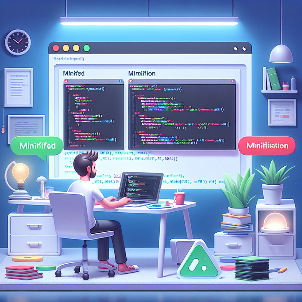
Minifying Your Code
To improve load times, consider minifying your CSS and HTML. You can use the CSS Minifier and HTML Minifier tools from WebToolsLab for this purpose.
FAQs
1. Can I use JavaScript for the animation?
Yes, while CSS animations are preferred for performance, you can enhance your animation with JavaScript if needed.
2. How can I adjust the speed of the animation?
You can modify the animation duration in the CSS keyframes to make it faster or slower.
3. Are there any browser compatibility issues?
Most modern browsers support CSS animations, but it’s always a good idea to check compatibility.
Conclusion
Recreating Apple’s Vision Pro animation in CSS is a fun and rewarding challenge. By following the steps outlined above, you can create beautiful animations that enhance your web applications. Don’t forget to experiment with different effects, and feel free to explore WebToolsLab for more utilities that can help streamline your web development process!